Roxy’s Dog Ranch
A new design for a 10 yr old dog ranch
overview
A website redesign and logo refresh
This website was a re-design of their original website dating back roughly 10 years. Our goal was to give them an updated look with better branding. The Project included a logo and website.
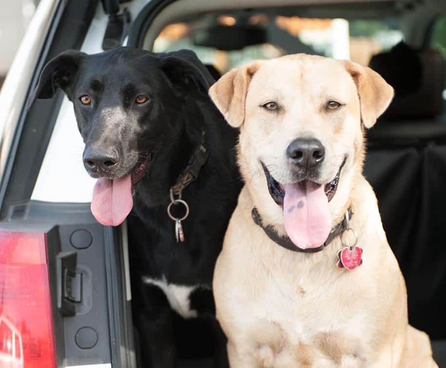
An old website with a lot of history
This is one of those times where you have an old website that is mostly functioning, but its not reflective of the company and their services. The pictures are dated, the pricing is wrong, and the site wasn’t responsive.
what we did
A new logo design to give the brand an identity and then a new website
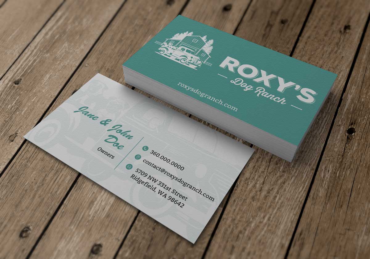
We spent time working on a new brand style for Roxy’s. This logo was designed to give a more retro feel to it. The blue color is specific to a color hue for that truck year.
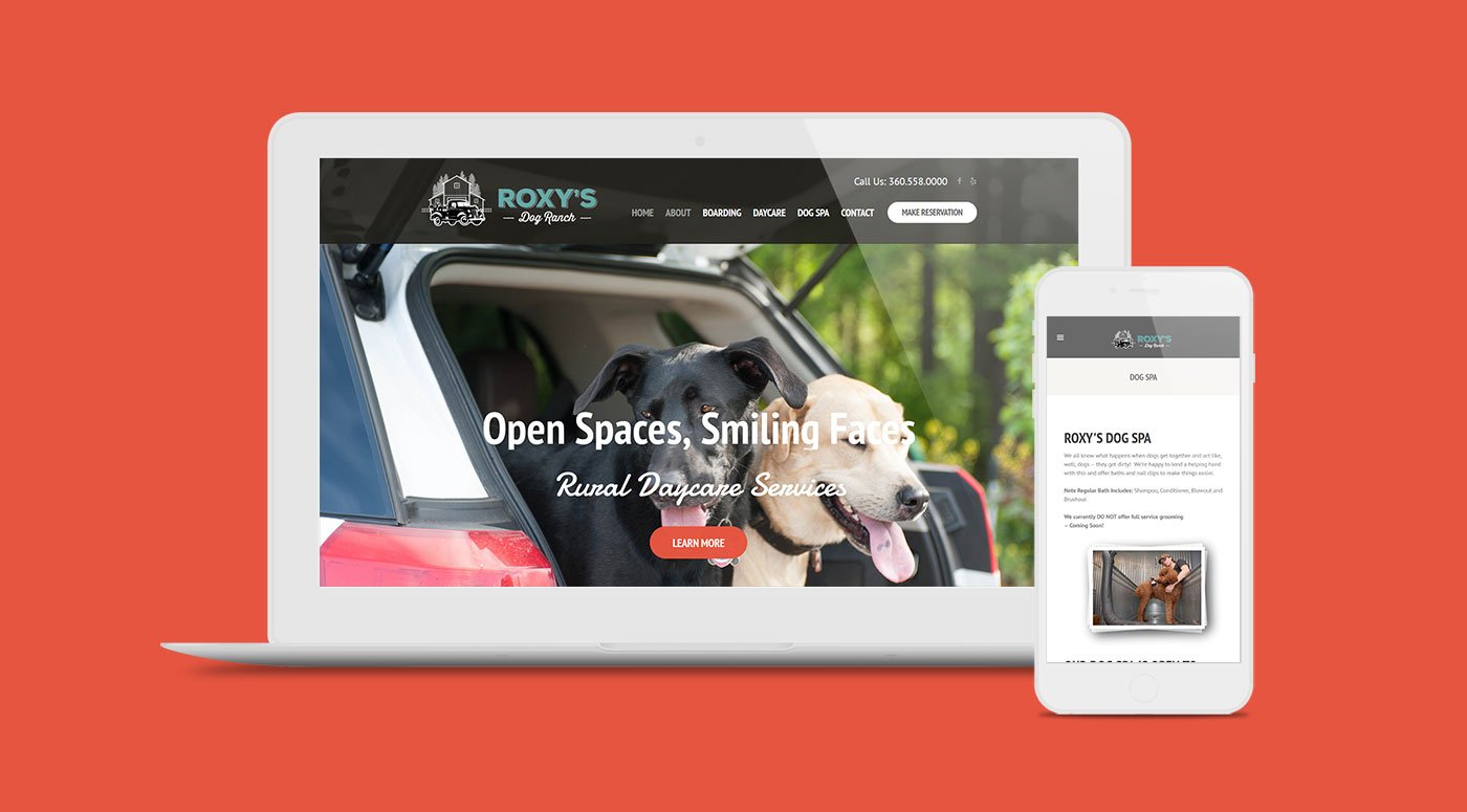
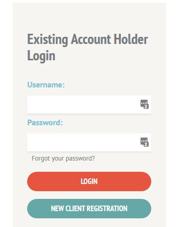
On the new website the clients can login to a reservation area. The new site enables the visitor to learn more about the facility, download medication forms, and access the boarding online booking system.
results
A Modern website with a modern look with a touch of classic
The logo really speaks to the brand now and we used that to influence the whole website design. It has better mobile usability now to.