Fitlandia
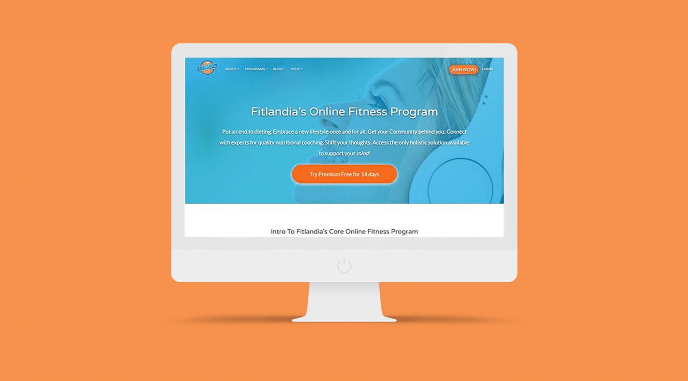
Website for a web app fitness website
overview
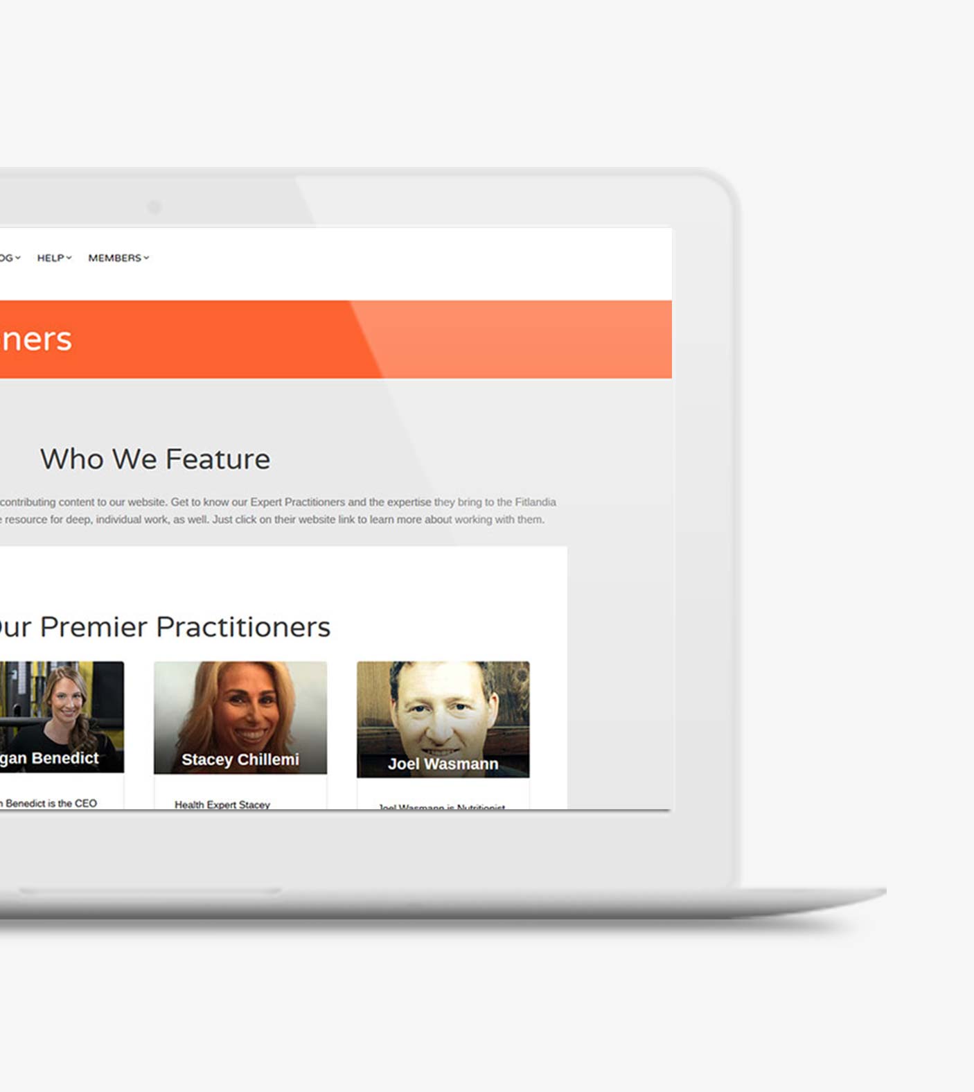
This was a multi-phase project. This website has multiple key functions like a membership area, and an affiliate signup, and a custom community chat forum.
One of the first things we did was give the website a new look and feel to help make it branded “Fitlandia”. A simple, awesome Portland brand needs an awesome presence on the web.
client
Fitlandia
services
- Design & Development
- Gated Content
date
May, 2016


A membership area with gated content
One of the things unique to this site was the member area. There were playable audio files you could play online when you login, and a few were set as freebie. The challenge was to make a select few available for all visitors and others unlock depending on your membership level.

what we did
Lorem ipsum dolor sit amet, consectetur adipiscing elit, sed do eiusmod tempor incididunt ut labore et dolore magna aliqua
The designer delivered us finished PDF’s to go off of, and we developed a custom landing page that was able to be updated by the client in the website backend. The page was built mobile first, and integrates into the design of the rest of the website seemlessly.


results
Delivering a new design to help them pitch to investors
Early on, we knew we wanted Fitlandia to be radically different than any other fitness company. We believe Mind Zoning™ is a key differentiator in addition to the Core Values that guide Fitlandia, a global leader in fitness.
Our new design helped them pitch their company to investors and gave the members a way to login and access professional quality content.