Table of Contents
Today, most of us spend hours scrolling through websites and filling out forms as we wait in line, commute, or during lunch breaks on our phones. Making sure that your business is using mobile friendly form design is a must.
At Northwest Media Collective, our designers and developers have come up with a list of the top ten mobile forms best practices to help you make sure your mobile forms are user friendly.
Why is Mobile Friendly Form Design Important?
A successful mobile form will create a positive experience and boost your conversions. Most times, the focus is on grabbing the user’s attention and informing them about your product or service. But if they find the form too difficult or frustrating to fill out, they may not submit it, and you could lose business.
10 Essential Elements for Mobile Friendly Form Design
There are so many ways to design a mobile form that it can be easy to feel overwhelmed or bogged down by all the information. So, to help make things easier, we created a short list of the top ten most important design elements for mobile friendly forms.
1. Reduce Input
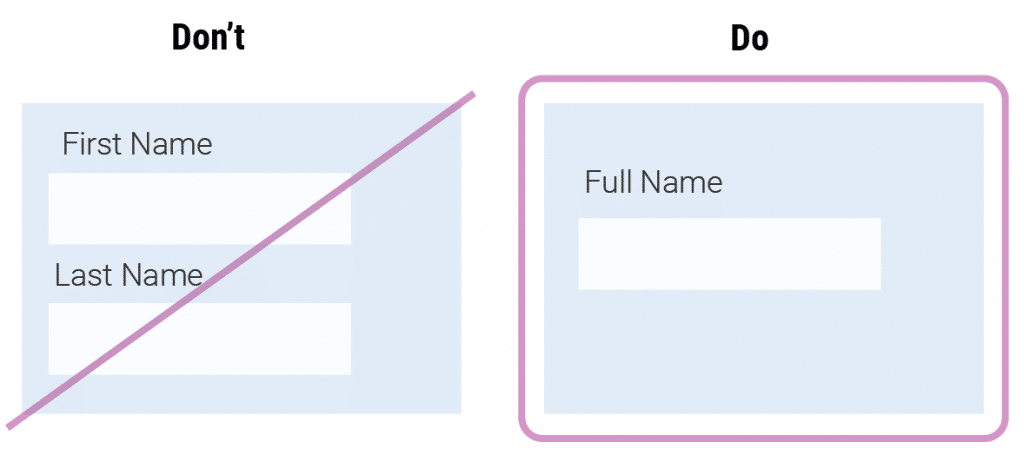
It’s easy for mobile screens to become cluttered with content and form fields. So, minimize and simplify the number of fields the user has to fill out. Combine form fields and label them with the least amount of words possible.
2. Design Finger-Friendly Touch Targets
How many times have you heard someone say “I have such fat fingers” when trying to text or click a link on their phone? The average adult finger is around 11mm, so a good rule of thumb would be to make sure your touch targets are no smaller than 9mm or 48 x 48 DP.
H3: 3. Provide Matching Keyboards to Data
Make sure the keyboards that appear for each field match the data that’s being asked for. This may seem like a small detail in the grand scheme of mobile friendly form design, but users will appreciate it.
There are seven types of form fields and here is the HTML for each that will call the matching keyboard:
- Input type=”text” provides users with a normal keyboard
- Input type=”number” provides users with a keyboard that displays numbers and symbols
- Input type=”email” provides users with a normal keyboard, but with the ‘@’ and ‘.com’
- Input type=”date” provides users with their mobile device’s date selector
- Input type=”datetime” provides users with their mobile device’s date and time selector
- Input type=”month” provides users with their mobile device’s month and year selector
- Input type=”tel” provides users with a numeric 0 to 9 keyboard
4. Avoid Dropdowns
Dropdowns take up valuable space and require multiple steps of the user. Instead, opt for toggle buttons or separate buttons for each item. These will create a much better user experience.

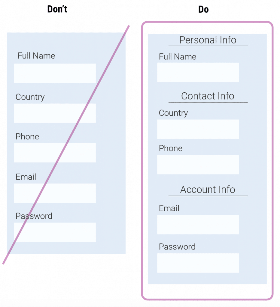
5. Group Related Fields
Using the Gestalt theory, related questions and fields should be grouped together. This rule helps the flow of your overall form and will help your users keep track of where they are.
6. Minimize # of Fields Visible
If a form seems to scroll endlessly, users may feel overwhelmed by the prospect of filling it in. So, along with breaking fields up into related groups, help your users by allowing them to minimize fields as they go. This will make your form feel more doable and go by faster.
Here are two ways that this can be done:
- Progressive Disclosure – Progressive disclosure shows users only a few of the most important options and then reveals more parts as the user interacts with it.
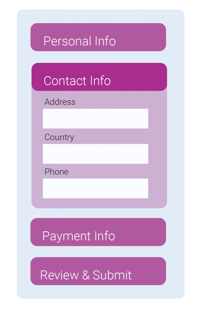
- Chunking – Chunking breaks up sections of your form into easy to follow parts.
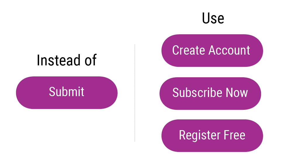
7. Keep Action Buttons Descriptive
Don’t let the energy of your words fade on your form, especially on action buttons. Buttons are the final step to users submitting their data and completing the form. Stay away from generic words and use words that describe the action of each button.
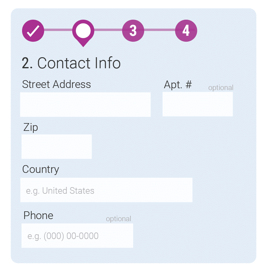
8. Make Form Location Visible
It’s okay if your form is longer or has more to it, there is no rule on how many fields you need to have or how short your form should be. But, regardless, allowing your users to see where they are at any given time in the process is important.
9. Distinguish Optional Fields from Required Fields
Don’t leave your users guessing which information is necessary for them to fill out vs which information they can skip if they want to. In a mobile friendly form design, fields that are optional have small text either at the top right corner of the form field or the lower right corner.
10. Add Help Text to Make Form Fields Understandable
If you’re the one creating the field forms, the questions you are asking may make perfect sense to you, but they may be confusing to your users. Use help text for fields that seem confusing or users may have a question about. The more you can help your users fill out the form correctly and avoid errors, the more likely they will finish the form and submit it.
Northwest Media Collective’s Design Team
There are a lot of mobile friendly form design strategies to choose from, but by at least adding these ten design elements, your form will be user friendly. At Northwest Media Collective, our designers and developers make sure that every design is user friendly for every device. Check out our portfolio to see our designs for a range of clients from construction to brewing to the art.
