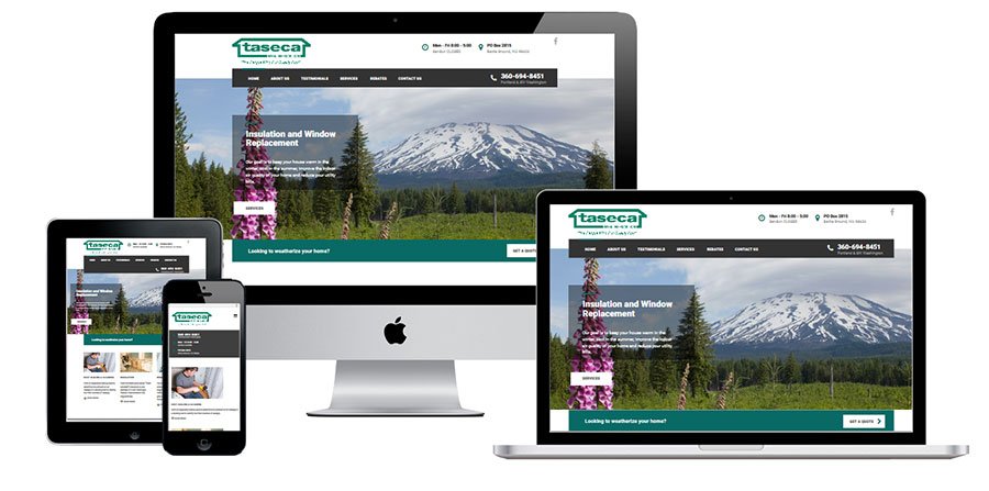
Being that he is in the home improvement space, we needed to give his site a modern look that felt closer to a home builder. His previous site wasn’t bad. It had a lot of content they had written. We just wanted to give the site a more “blocky” structured home feeling.
They had some amazing testimonials, and we wanted to make sure to highlight these across the site. The other thing we did was highlight the services. The services page helps grid out the different things Taseca does. This helps a visitor find a service quickly and easily see a phone number or a way to contact them.
The new site was built responsive. Mobile first. We knew we wanted the mobile version to show all the contact info at the top. The mobile (hamburger menu) sits next to the logo and makes room for the “blocky” contact bars.
